Refining a VC Ready Narrative
Context
Sabado involved the redesign of an existing investor presentation that required structural refinement while preserving the original strategic content.
The objective was not to create a new narrative, but to enhance clarity, hierarchy, and visual coherence within the constraints of established messaging and brand guidelines.
Role
My role focused on visual restructuring rather than content rewriting. I worked within the existing material to improve readability, emphasize key insights, and align the deck with professional investor communication standards.
This required analytical judgment — determining what to retain, what to reorganize, and how to elevate clarity without altering intent.
Challenge
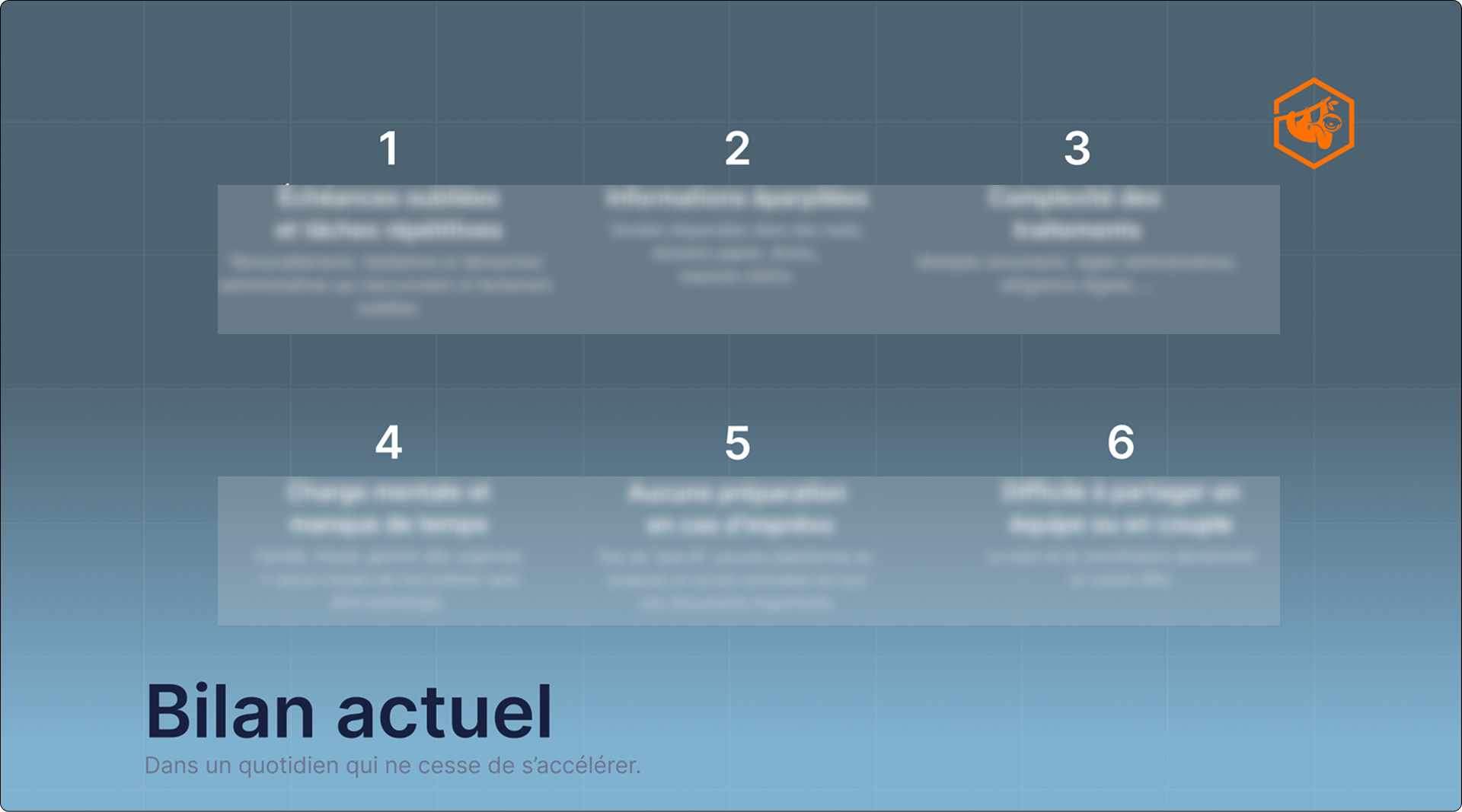
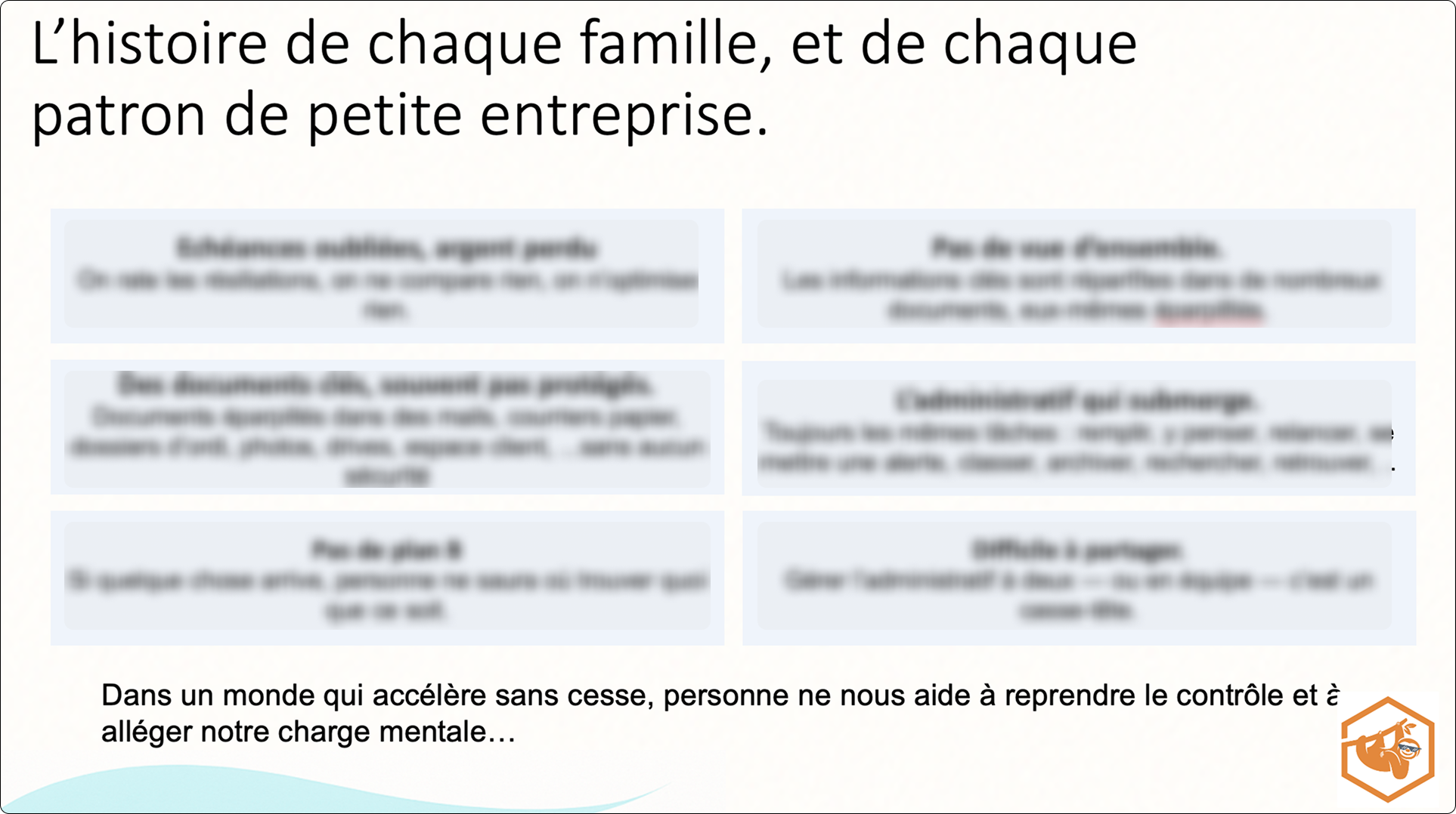
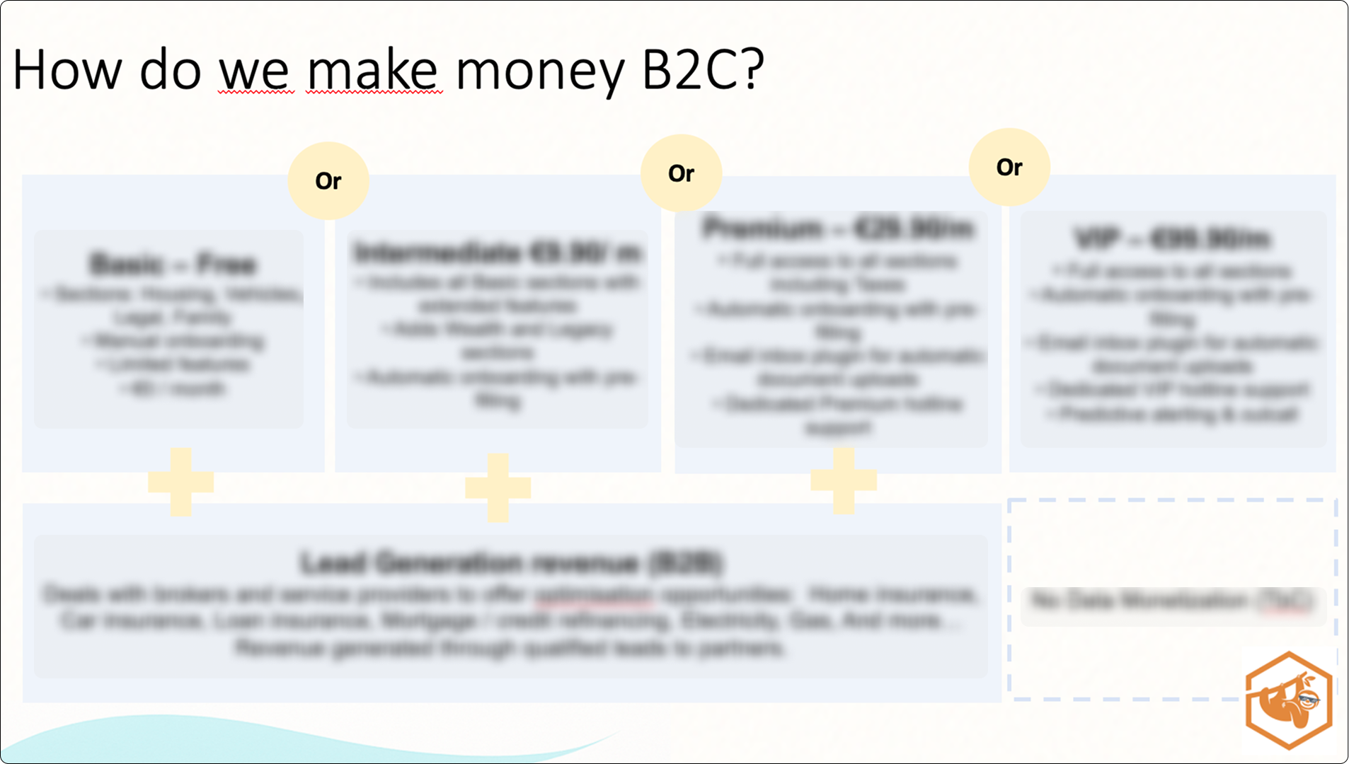
The initial presentation contained valuable information but lacked hierarchy and visual prioritization. Competing graphic elements, inconsistent spacing, and dense layouts reduced scannability and obscured the core message.
The challenge was to:
Clarify the central takeaway of each slide
Reduce cognitive overload
Establish visual order without oversimplifying content
Maintain brand consistency throughout

Process
The redesign followed a structured three-step methodology:
1. Identify
I analyzed each slide to determine its primary message and supporting information.
2. Define
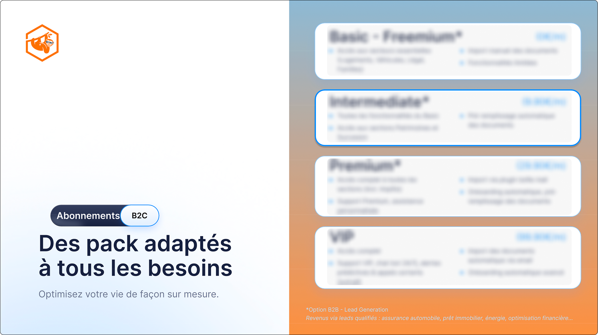
Content was reorganized into clear hierarchical levels — headline, key insight, supporting detail — ensuring that the most important information was immediately visible.
3. Design
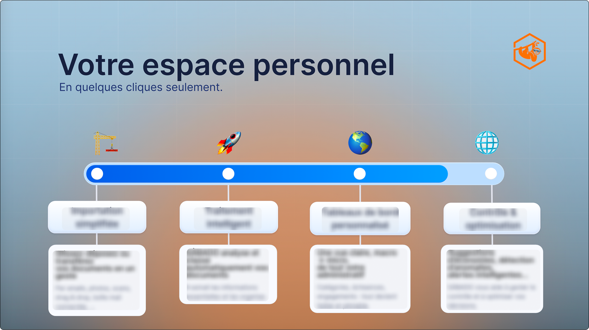
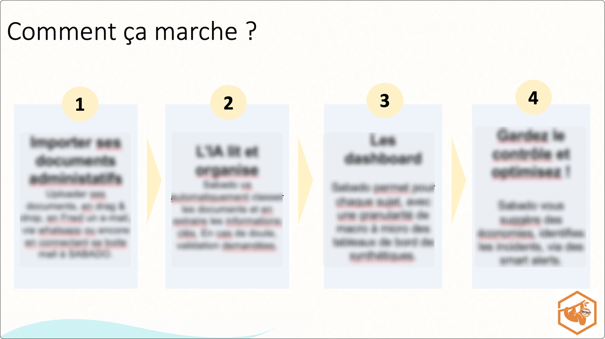
I applied a simplified layout system using consistent spacing, controlled typography, and restrained visual elements. Decorative components were reduced to eliminate distraction, and contrast was used intentionally to emphasize key data points.
Brand guidelines were carefully respected to ensure alignment with the company’s visual identity.
Outcome
The refined presentation achieved:
Improved readability and visual balance
Clear emphasis on strategic takeaways
Stronger alignment with investor communication standards
Greater cohesion across slides
The updated design demonstrates how disciplined visual restructuring can enhance strategic clarity without altering core content.
Reflection
This project reinforced an important principle: clarity is achieved through intentional reduction.
By subtracting unnecessary elements and strengthening hierarchy, the presentation became more analytical, structured, and decision-focused — essential qualities in professional and information-driven environments.
Skills Demonstrated
Information prioritization and hierarchy refinement
Content restructuring without narrative distortion
Visual simplification under brand constraints
Editorial judgment in layout decisions
Scannability optimization
Slide deck standardization and consistency
Decision-oriented communication design
Attention to detail in professional presentation contexts